Website trends are constantly evolving. Designs that look fresh and exciting today can look stale and outdated in just a few short months. At Studio Anansi, we stay up with the latest web design trends — but not for the reasons you may expect!
We don’t believe in trying to incorporate every trend in every website. Instead, we scrutinize popular styles to decide what makes sense for each of our custom websites. When new styles fit with a client’s brand and vibe, we know it’s a solid match that will feel authentic and timeless for years to come.
Here are three current web design trends we expect to continue in popularity, plus tips to consider for your website and brand.
#1 – Gradients
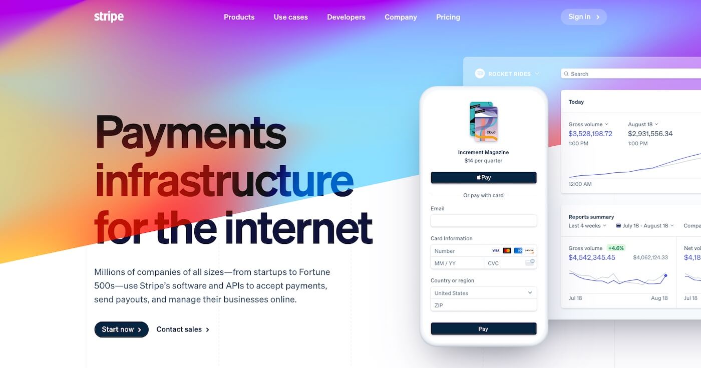
Love ‘em or hate ‘em, gradients are all over the web. 2020 saw the return of gradients and that trend isn’t disappearing. This year, we predict even more gradients will appear as the trend trickles from big-name brands such as Stripe down to DIY website builders such as Squarespace.
Stripe.com currently features a vivid gradient background
Our advice:
If gradients make sense for your brand and you like the look, go for it! Gradients are all about being playful, so have fun with them. Test using gradients in different places on your website — perhaps as a background, lettering, or icons. But remember to use your brand colors to keep gradients aligned with your brand.
#2 – Vintage Fonts
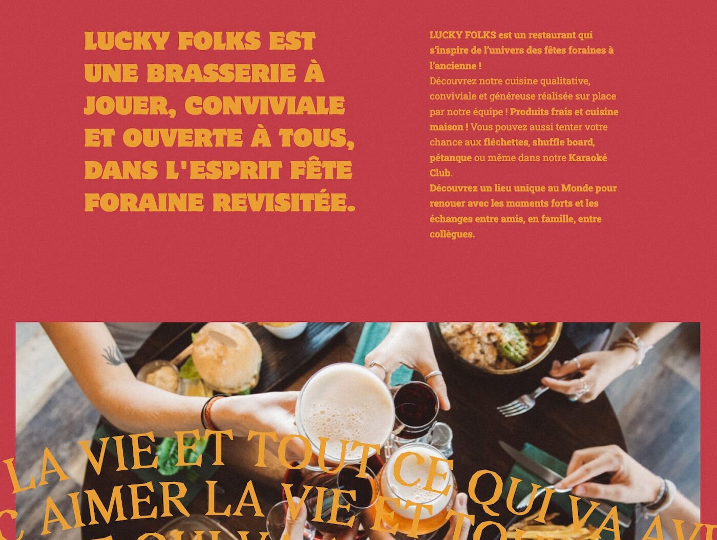
Vintage fonts are back in a big way. Retro font styles are popping up everywhere online, from local restaurant websites to luxury brands.
Multiple retro fonts on display at luckyfolks.fr
We love the antique look of these fonts, but be careful! Building your brand around a font that’s in fashion now may result in a website that looks outdated in just a matter of months.
Our advice:
If vintage makes sense for your brand, use it! If you just want to experiment with vintage, incorporate it in some graphics but do not make it a pillar of your website or brand identity.
#3 – Mobile-only navigation
Mobile navigation is nothing new. For years, mobile-forward navigation has resulted in website menus adapted to smaller screen sizes. Think of the = or + symbols on your mobile phone screen.
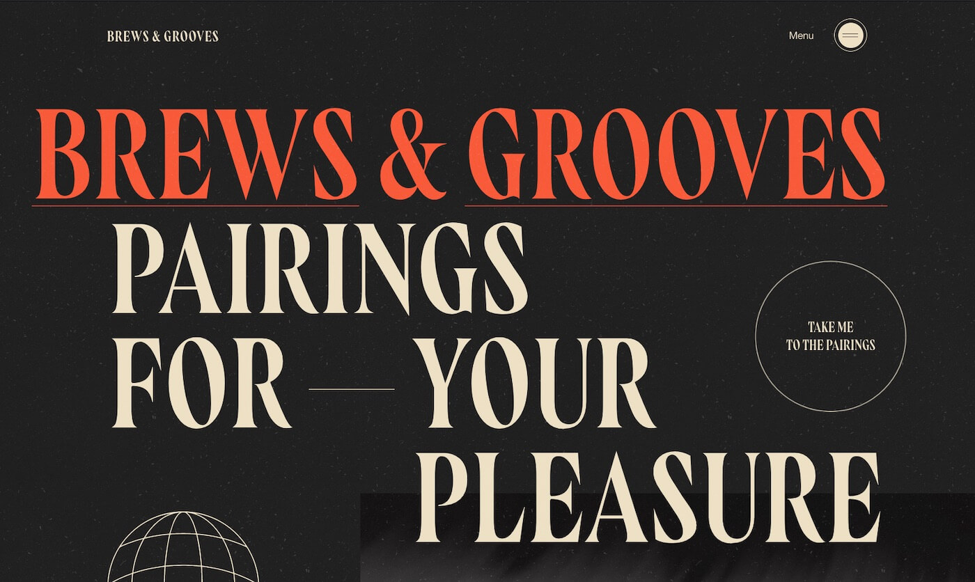
Lately, you may have noticed the rise in mobile-only navigation. Desktop and laptop versions of websites are starting to display mobile menus, without any of the horizontal or vertical navigation of years past.
Spot the menus on sandboxfilms.org and brewsandgrooves.com
This design choice is great for websites that are primarily meant to be viewed on phones. It certainly makes for sleeker website design. However, it’s not always the right choice — especially if your website audience skews older, visits on their computers, and is accustomed to having a clear, obvious menu.
Our advice:
Check your visitor data to see how many visitors are on mobile devices. Unless most of your audience is mobile, probably don’t ditch the traditional menu structure. Instead, make it sleeker by decreasing the number of menu options and eliminating multi-tiered dropdown navigation.


