Web design trends are constantly changing. If you want your website to stay fresh and relevant, it’s important to keep up with the most recent trends in website design.
Good design is timeless, but excellent design adapts.
Even the most strategic, well-thought-out brands benefit from paying attention to evolving design trends. Here are six web trends that we predict will continue to grow this winter and into 2022.
Dark Mode
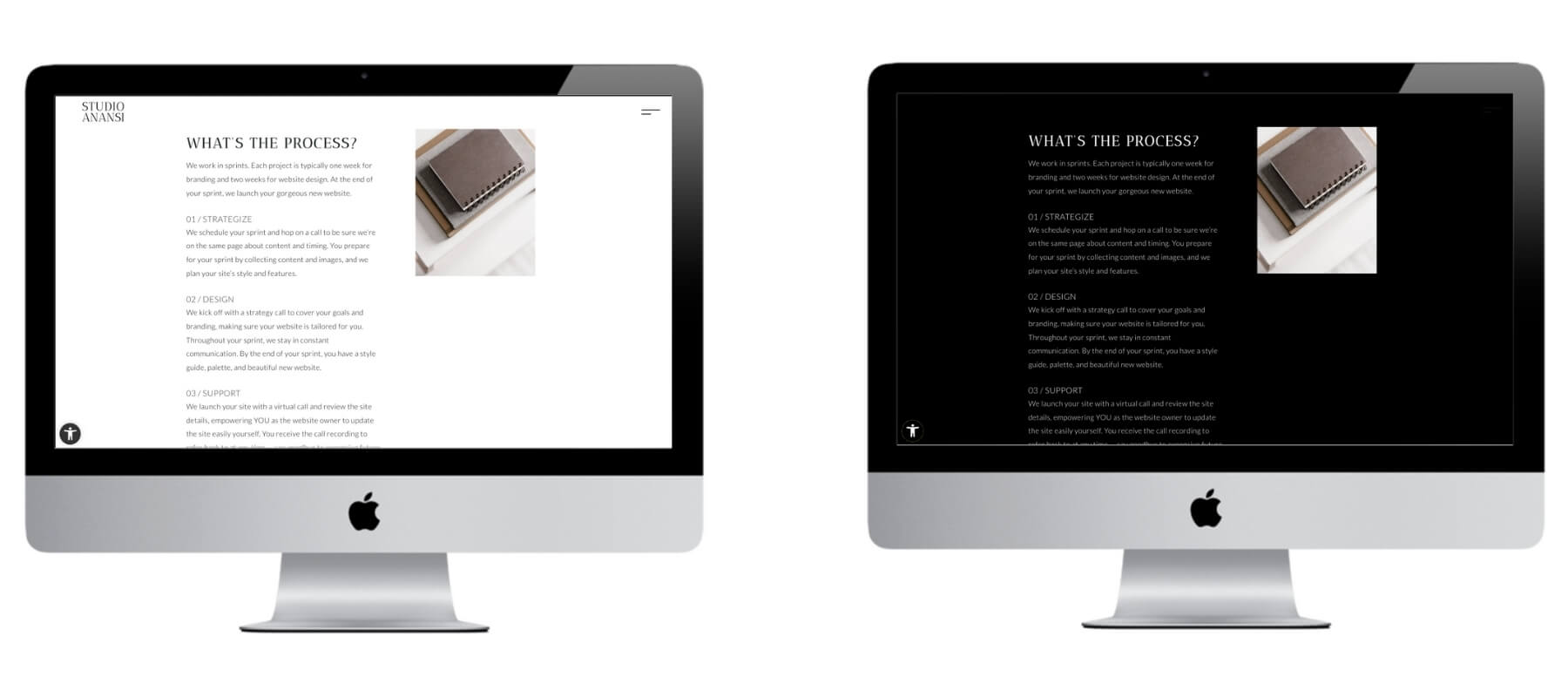
Dark mode is a website design option that changes the background from white to black, saving battery life and generally making displays easier on the eyes.
Many website accessibility tools offer a toggle that changes light backgrounds to dark. In fact, our own website has a dark mode option to improve inclusivity.
At first, dark mode was generally applied during night hours. But dark mode isn’t just for nighttime anymore. Major brands such as Apple, Facebook, and Youtube all offer dark mode displays, and Google recently jumped on the trend with dark mode search displays. We expect dark mode to continue to grow in website importance in 2022.
Read More: 5 Ways to Make Your Website More Accessible
How does Studio Anansi incorporate dark mode in our website designs? We love minimalist, clean displays — and that organization is possible with dark backgrounds. We keep dark mode in mind as we design and ensure that content functions with both dark and light backgrounds.
Collages
Photographs and graphics are hugely important on websites. They act as visual cues to engage and guide website visitors around your site.
Read More: Five Free Photo Sources for Your Website
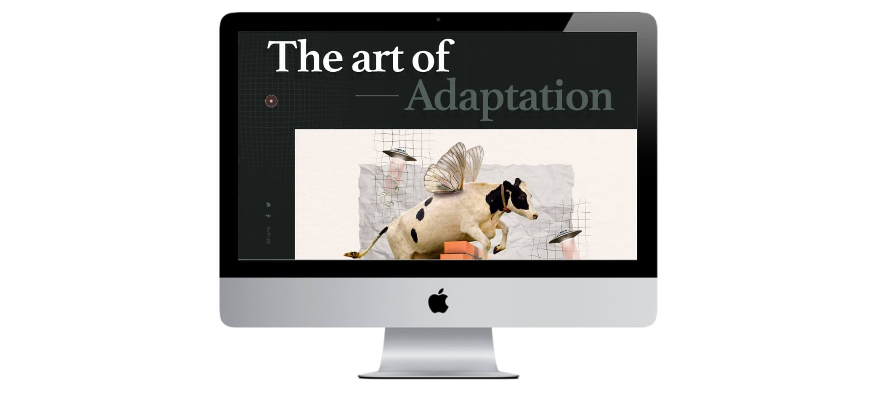
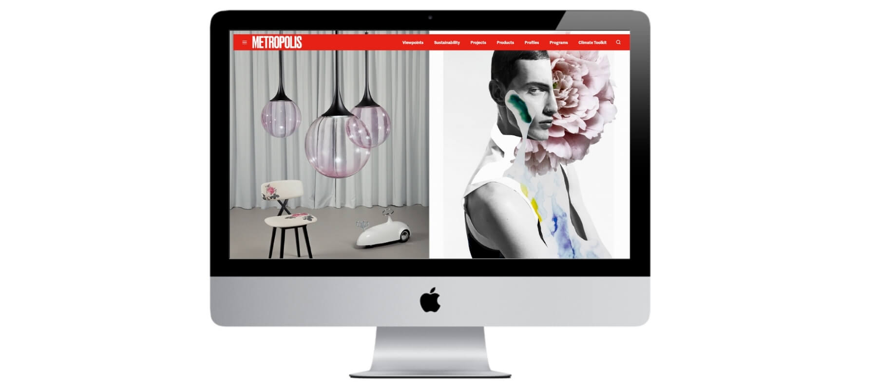
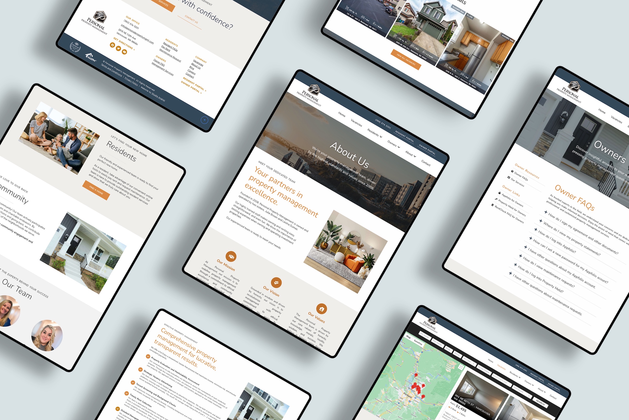
Many modern websites are moving away from single hero images. Instead of featuring one large banner image, designers are opting to create collages.
Collages can make sites more engaging than a single photograph. They also provide more open space and opportunities to showcase different aspects of a product or service.
How does Studio Anansi incorporate collages in our website designs? At Studio Anansi, we love to add engagement and design intrigue with multiple graphics. We create collage-type images that have different elements, from photos to patterns.
Minimalism
Minimalism in web design isn’t new, and the trend is only getting stronger.
Minimal website designs are popular for a reason. They work because they focus on the most important information and eliminate any superfluous elements that may distract users from your content.
Even sites with maximalist aesthetics — such as many bright graphics and dynamic elements — are moving towards minimalism by paring down content.
How does Studio Anansi incorporate minimalism in our website designs? Studio Anansi has incorporated minimalism in our website design process since day one. We love to create clean, clutter-free website layouts with easy navigation limited to six items in the main menu bar.
Mobile Usability
We wrote about mobile-forward navigation in our last round-up of evolving website design trends. As we wrote then, mobile navigation can make for sleeker website designs even on desktop displays.
Read More: 3 Current Web Design Trends to Consider for Your Brand
Mobile design has become even more important in recent months. Google’s latest updates heavily feature mobile usability, aka the ease with which mobile visitors can use your site. Improving your mobile usability makes your site better for visitors and you’re attractive for search engines.
Read More: Google Core Web Vitals — What to Know and How to Prepare
How does Studio Anansi incorporate mobile usability in our website designs? Our website design process always considers mobile usability. We test designs on multiple devices to ensure that your visitors have an excellent experience no matter which device they use. Plus, our emphasis on mobile design makes your website even more attractive to Google — so you can rank higher from day one.
Delicate Linework
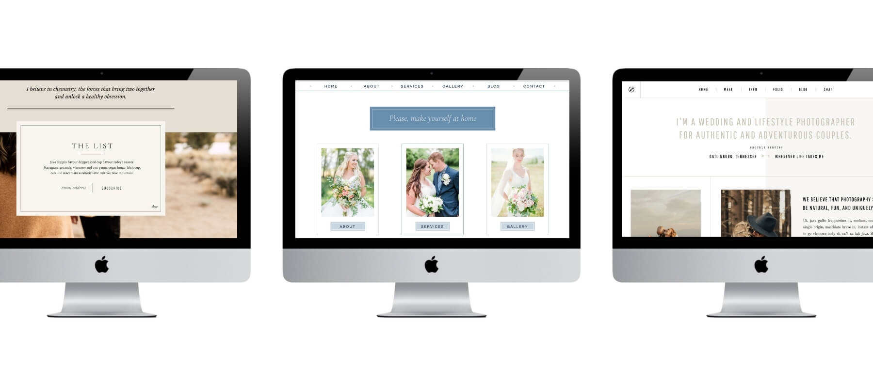
The trend of using delicate lines to divide page grids has grown quite a bit recently. Horizontal and vertical lines can quickly and easily separate sections into images, headers, paragraphs, and galleries.
However, it’s easy to overuse linework. Some modern website design platforms use linework so distinctively that you can spot the platforms just from the similarities in lines. (Yes — we’re looking at you, Showit.)
How does Studio Anansi incorporate delicate linework in our website designs? Linework isn’t a good fit for every site, but we find that it can add elegance and visual interest to pages that would otherwise be stark or empty. We incorporate lines to direct visitor attention and guide audiences through sites when appropriate.
Gender-Neutral Content
2021 has seen the rise in gender-neutral web design. Design is moving away from gendering websites, such as hyperfeminine skincare sites or aggressively masculine sports sites.
In part, this move is due to more inclusive social trends — and in part, it’s just a smart business move.
According to recent statistics, 56% of people searching online for sports accessories are female while 68% of men look for skincare products. [Webwingz]
As designs move away from gendered content, it’s becoming more normal to feature they rather than she or he, gender-neutral colors such as brown and gray, and images featuring different types of people.
How does Studio Anansi incorporate gender-neutral content in our website designs? We are committed to inclusive design. Our clients know that from the first intake form, we ask each person’s pronouns. During the design process, we craft designs that appeal to your target audience without assuming gender or interest as much as possible.
Ready for a fresh, modern website?
Get in touch to inquire about our current availability.
