Looking to quickly level up your web design?
Want a website that is polished and professional?
Get ready for one of the most powerful tools in the professional web designer’s arsenal…
Website Brand Guidelines
If you’re new to the world of web design, you may not have encountered website brand guidelines.
When I first started building websites, I had never heard of them! If you had mentioned website brand guidelines to me, I’d have said….
Website whatnows?
Whoozawhatsas?
But years later, I’ve fallen in love with website brand guidelines.
In fact…when I’m building a site, one of the very first things I do is create guidelines.
They’re an incredible way to define website style, saving me (and my clients!) hours of frustration.
In this article, you’ll find a ton of information to create your own website brand guidelines:
- The benefits of website brand guidelines
- Four website brand guideline essentials
- Logo
- Fonts
- Images
- Colors
I’ve also included a free website brand guideline template and example website brand guideline.
(Plus, check out more website brand guideline examples here!)
Before we go any further…
Why You Need Website Brand Guidelines
Before I created brand guidelines, there was a TON of back-and-forth between me and each website client.
Every step of the design process took fooooorever.
Clients and I had seemingly endless revisions about colors, fonts, photographs, and tone. Some websites even had major changes halfway through the design process!
Trust me, there is *nothing* more frustrating than thinking a design is completed…and then a last-minute edit completely upends the design.
(Real talk, I’ve been in tears before because a client decided on a last-minute switch to a new color — resulting in hours of new work at the eleventh hour before a website launch. Major yikes.)
Who was to blame for the frustration and delays?
Well, one person had the job of guiding clients through an easy design process…
Yep.
Yours truly.
C’est moi.
Sure, there were some extra picky clients. But most of the blame was MINE. I wasn’t guiding my clients through designs in an easy, clear path.
No wonder I remember those early days as being as frustrating as they were rewarding.
Once I started creating website brand guidelines for clients, my website design process got so much smoother and easier to manage.
Instead of constant back-and-forth throughout the whole design process, the client and I begin everything with a standardized, one-page document outlining the brand guidelines.
If you’re building a new website, this document will help you…
- Define your style
- Quickly record brand colors
- Ensure cohesion on- and off-line
- Create beautiful marketing materials
- Save you hours of frustration
And even if you already have a site, it’s worth creating website brand guidelines! They will help unite your marketing, define your style, and serve as a fast reference in the future.
Set aside an hour to create website brand guidelines. They will save you TONS of time and help you for years to come.
What to Include In Website Brand Guidelines
Have you ever felt…
- Frustrated that your website logo isn’t the right size or color?
- Like you’re just guessing for website colors or fonts?
- Unhappy with your website appearance — but you can’t say exactly why?
- Unsure which featured image to post with your latest article?
- Confused about how to make your ads match your website?
If so, it’s time to reestablish and save yourself time with website brand guidelines.
Brand guidelines record your logo, fonts, and brand colors. They help to create cohesion across your online and offline presence.
A brand identity (expressed in your guidelines) shows the world your personality and demonstrates business consistency.
Think of it your business like a friendship…
Imagine a friend who is always punctual, tidy, and impeccably well dressed. But one day, that friend shows up to brunch an hour late, wearing grungy jeans and a stained shirt.
Your punctual, tidy friend is suddenly acting very out of the ordinary. You may be concerned or even uncomfortable.
The same situation happens with your brand. Consistency reassures your audience, while inconsistency can confuse and dissuade them.
Without a coherent brand style guide, potential customers may be left wondering about your business and trustworthiness.
What’s worse, you may find yourself feeling confused or overwhelmed every time you produce new content.
Ever felt like you’re wasting time trying to find the right images for a new blog article? Or spinning your wheels trying to design new pages?
Get ready to get laser-clear about your brand by creating brand guidelines with four components:
- Your Logo
- Two Fonts
- Inspo Images
- Four Colors
First up — let’s talk about your logo.
Logo
Your logo is oftentimes the most immediately recognizable element of your brand.
Think of the Nike swoosh, McDonald’s arches, and Amazon smile. They’re all easily recognizable and quickly come to mind.
Of course, maybe your logo is just a smidge less famous than the golden arches…
Even if you’re not a global brand, your logo is still super important for first impressions. It tells your customer if you are cheerful or serious, elegant or earthy.
If you already have a logo, you should absolutely include it with your brand guidelines.
If you don’t yet have a logo, it’s time to get one.
Do you have a marketing budget? If so, consider hiring a designer to develop a custom logo for you.
But of course…many small businesses just don’t have the budget for a customized new logo.
If that’s the case, consider investing in a wordmark. A wordmark is simply your name or business name written in a distinct font.
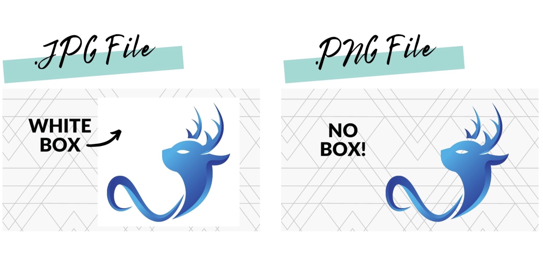
Plus here’s a pro tip from years of web design experience. Save copies of your logo/wordmark as both .jpg and .png files.
Many logos include .jpg or .jpeg by default — but you will need a .png file for a transparent background. If your logo doesn’t have a transparent background, you’ll see a box around it:
If you have a designer (or if you’re using a tool like Canva), make sure you store both types of files in the largest resolution available.
Having a logo with the background already removed will save you TONS of time down the road.
Now that you’re thinking about a logo, let’s dive into another aspect of design — your fonts.
Fonts
Your fonts will also communicate a lot about your brand and business.
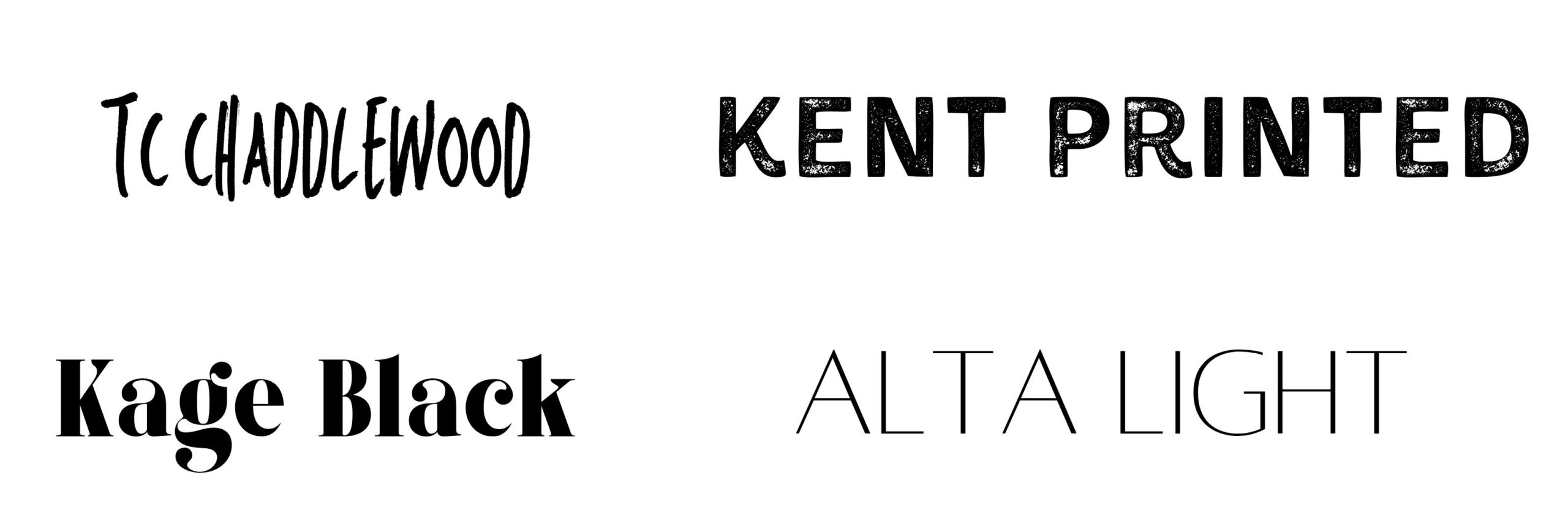
Compare the fonts below. Each has a different “feeling” — serious or playful, elegant or classic.
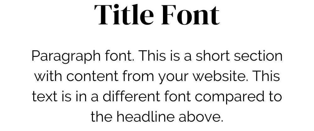
Your website design guidelines should have at least two fonts: a title font and a paragraph font.
I typically recommend choosing different fonts for the titles and the paragraphs. By choosing fonts that contrast, your titles will stand from your main content and images.
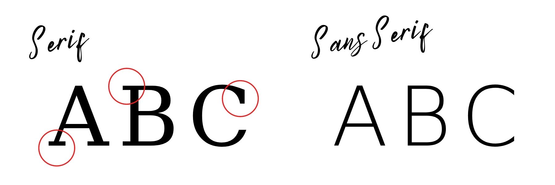
As you evaluate fonts, you’ll find both serif and sans serif options.
Serif fonts contain a decorative stroke at the end of letters — the “feet” of the letters. Serif fonts are typically considered traditional, solid, trustworthy, formal, and classic.
Sans serif fonts lack the decorative strokes of serif fonts. These sans serif fonts convey a brand that is modern, clean, casual, approachable, and youthful.
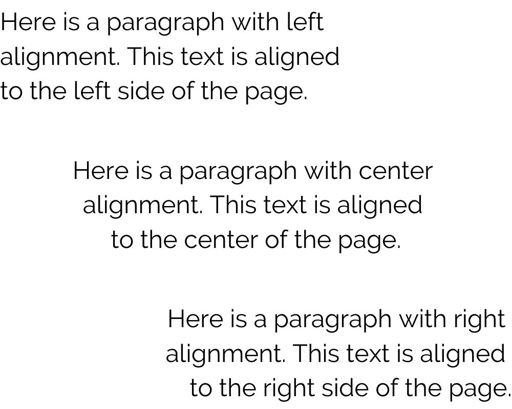
In addition to the font style, also consider text alignment. Your text could be aligned to the left, center, or justified. In general, centered text appears cleaner on a screen — but left-aligned text is oftentimes easier for viewers to read, especially online.
So why should you include fonts in your brand guidelines? Well, it can be expensive and time-consuming to change materials down the road. Updating fonts on your website and editing marketing materials to new alignments takes time.
Decide your fonts and typographic styles before you start designing online and print marketing materials.
(And here’s another designer tip — check out these Google Fonts for tons of options to test!)
Once you know your fonts, now it’s time to add images and colors to your website brand guidelines.
Photographs
By now you have a logo or wordmark. You have fonts. Your content is looking clean and cohesive.
But a website is about much more than just text. You need images on your website — and picking the right images is much easier when you have inspiration photographs in your brand style guidelines.
Some designers call this section a “mood board” and keep images separate from the other brand guidelines. However, I prefer to keep everything in one place for fast, easy reference.
Rather than separating your website brand guidelines and your mood board, I recommend adding photographs directly to your brand guidelines. Choose at least four photographs to serve as inspiration and reminders of your emotions and messaging.
If you already have a website or marketing materials, look back at your main images.
Identify which ads have produced the best results, and which images stand out to customers. You could even do a little light market research by asking a few customers (or even just friends) which images best convey your brand.
If you don’t have a website or ads, look at your competitors to define your aesthetic. Ask yourself…
- What do you like about their visuals?
- What do you dislike?
- What do you see and think, “I can do better.”
Once you identify your brand aesthetic, collect images that portray the mood you will associate with your brand.
Google images and Pinterest are easy places to start looking for images, but beware! Many of those images are copyrighted, so you absolutely can not use them on your website.
You really, really don’t want to get on the wrong side of copyright law.
When you’re ready to find images that may be used on your website, I recommend searching on free photo sites such as Pexels, Unsplash, and Pixabay.
When you’ve identified a few photos, save them to your computer and get ready for a cool trick to create a beautiful color palette.
Colors
Your website colors will also convey the mood and tone of your business. Think about what emotions you want to portray with your brand.
Are you more playful or serious? Vivacious or stable? Approachable or authoritative?
Here are some general color guidelines:
- Red = Passion, excitement, urgency, energy
- Orange = Vitality, cheerfulness, confidence
- Yellow = Optimism, happiness, excitement
- Green = Health, nature, relaxation, harmony
- Blue = Strength, intelligence, security, stability
- Purple = Wisdom, elegance, creativity, beauty
Of course, colors are specific to different cultural contexts. If you’re designing a website for a Japanese shop, the colors will probably have very different meanings compared to a Danish store.
When you’re ready to pick colors, I recommend choosing four colors.
- Light
- Dark
- Neutral
- Accent that pops
More than four can easily make a website look too busy or crowded. Even if you’re only using three colors for your website, save four so you have future options for additional marketing materials — you never know when you’ll want another accent color to add vibrancy to buttons!
If you’re feeling overwhelmed or don’t know where to start, I suggest checking out tools such as Coolors or Adobe Color.
Alternatively, take one of the photos you saved earlier as an inspiration image. You can use a free tool such as Canva to identify the main colors from that image.
Once you have identified four colors, save them as HEX codes. HEX (short for hexadecimal) codes are the six-digit combination of letters and numbers that define colors online. For example…
White = #FFFFFF
Pink = #FF80ED
Gray = #CCCCCC
Black = #000000
Save your colors as both HEX and RGB, short for Red-Green-Blue. RGB codes are useful for creating opacity and some of the advanced styling tricks for websites — so yes, it really is helpful to have both HEX and RGB.
The number systems to identify HEX and RGB are very different. For example…
White = #FFFFFF = rgb(255, 255, 255)
Pink = #FF80ED = rgb(255, 128, 237)
Gray = #CCCCCC = rgb(204, 204, 204)
Black = #000000 = rgb(0, 0, 0)
Use this website to convert HEX to RGB, and this website to convert RGB to HEX.
Advanced tip: If you’re working with a professional designer to develop a color palette, also ask for your colors in CMYK and Pantone. With those, you’ll have documentation for future print materials like magazine ads.
Example
Whew — ok, I know that was a lot of info.
Ready for an example?
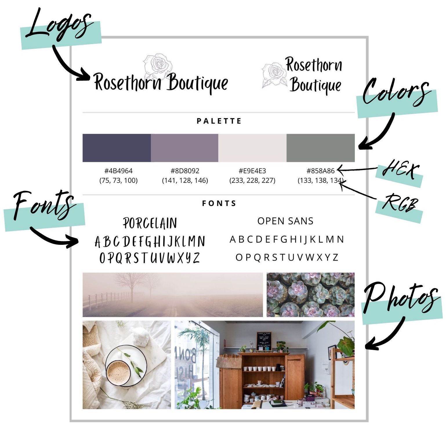
Here’s a sample website brand guideline page, complete with all the components I covered:
Plus, you can check out more website brand guideline examples here.
Ready to create your own brand guidelines?
You can use my free Canva template to create your brand guidelines now.
Enjoy — happy designing!

