Does your WordPress website look bad on mobile? It’s time to take action.
If you’re wondering what I’m talking about, hop onto your phone right now and visit your website. You’ll notice that the experience is completely different from visiting on your desktop or laptop.
It can be frustrating and embarrassing for customers to navigate through pages with tiny text and links that are too close together. And in today’s digital world, this user experience matters. A lot.
Over 50% of all web traffic is on mobile devices. If you’re anything like me, this comes as no surprise. We’re constantly glued to our phones. People spend the majority of their time on social media and other online activities through a mobile device.
And they’re not just browsing Instagram or checking out TikTok. People are also trying to shop, potentially from you. E-commerce has exploded recently, and even local shoppers are looking online. 61% of mobile users are more likely to contact a local business with a mobile site.
To stay relevant online, you simply can’t afford to ignore mobile website design.
What is “Mobile Responsiveness” in Website Design?
Mobile responsiveness is the practice of designing a website to work well on all screen sizes. The website content responds to the mobile device.
These devices include smartphones, tablet computers, and desktop screens. A responsive website adjusts the layout appropriately for every type of screen.
Some web designers distinguish between “mobile-friendly” and “mobile-optimized” websites. There are slight differences between these two terms — but for the average website owner, the terms are functionally interchangeable.
Three Tips for Mobile Website Design
Follow these three tips for designing an easy‐to‐use, mobile‐friendly site that will please your visitors with every type of screen.
Test your site for responsiveness
To begin, test your site to see if it actually changes according to your screen size! Pull out your phone or use online tools to check your website’s appearance.
Do the pages adapt to the screen size?
Can you easily read text and see important images?
As you test your website, also keep an eye on the loading time. Slow mobile load times can impact visitor experience and lower your Google rankings. Make sure your mobile website loads in no more than 2.5 seconds at most.
Adjust font sizes
Adjusting the font size is one of the most important aspects when it comes to mobile design. It will provide an easier, more pleasant reading experience for your visitors on smaller screens.
Readers prefer larger text and less scrolling. Think from the perspective of your audience — if you have trouble reading tiny text or fonts that are too light, chances are your audience will also have issues!
Make sure your fonts work well for small screen sizes up to large desktop monitors. Use relative units like percentages or ems in CSS rather than absolute values such as px. You might even consider setting up multiple style sheets for different devices.
Optimize logo style
Many website owners forget to change their logo layout for small screen sizes. If your logo is large or uses a vertical layout, it can easily distract from the rest of your page content.
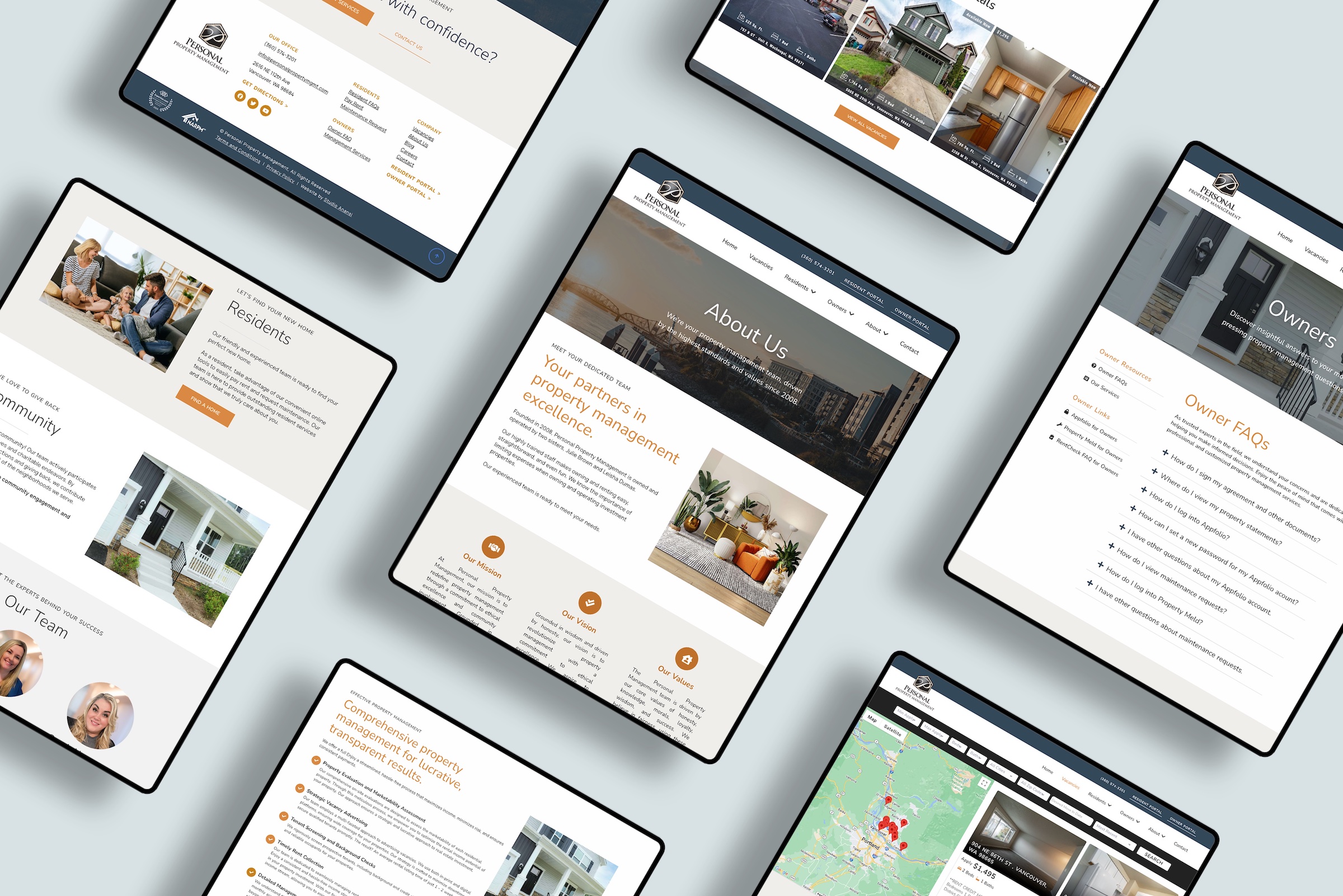
At Studio Anansi, our logo designs always include at least two optimized layouts — including a horizontal option that works for mobile logos. See an example of a website we redesigned to improve the mobile layout.
Ready to boost your website’s mobile score?
All our designs are optimized for desktop and mobile traffic. If your site is built by Studio Anansi, you already have a mobile-friendly website!
If you want to improve your website layout and optimize for mobile traffic, let’s talk. We love helping website owners refresh their website designs — get in touch to check our current availability.


