Looking for some inspiration for your website brand guidelines?
Or maybe you’re wondering…
Um, what exactly are website brand guidelines to begin with?
If this is the first time you’re hearing about website design guidelines, start here:
START HERE ? Create Easy & Elegant Website Brand Guidelines
That intro article will give you all the background info on brand guidelines.
It covers…
- Your logo
- Choosing fonts
- Finding images
- Picking colors
Right, you all caught up?
Inspired to create your own guidelines?
Fantastic — let’s do it! I’ll walk through three examples of website brand guidelines and explain each element.
Hopefully these can inspire your own website brand guidelines. When you’re ready to create your guidelines, download my free website brand guidelines template from Canva.
Happy designing!
Example 1: Boutique Website
First, let’s look at website brand guidelines for Rosethorn Boutique, a fictional neighborhood gift shop in ye olde Towntown.
LOGO
The boutique logo uses a handwritten font, giving it a feeling of warmth and friendliness. Plus, the rose icon ties into the name of the shop.
Note that there’s both a vertical and horizontal layout of the logo. This is important to give the boutique options for marketing and logo placement in the future — the owner will be able to use her logo in different layouts without having to waste time recreating logo files.
COLORS
The boutique owner has chosen purple tones. She has selected a dark and light purple, neutral pale gray, and muted green-gray to serve as the accent.
Overall, the colors are calm and inviting — there’s no jumble of neons or clashing colors here.
FONTS
The fonts are quite different, so the titles and paragraphs will be distinct.
The title font, PORCELAIN, is the same as the logo font. It is bold and easy to read. Besides uniting the logo and titles on the website, this font will also stand out on webpages and in print.
The paragraph font, OPEN SANS, is modern and crisp. It will be distinct from the handwritten appearance of the logo and boldness of the title font.
IMAGES
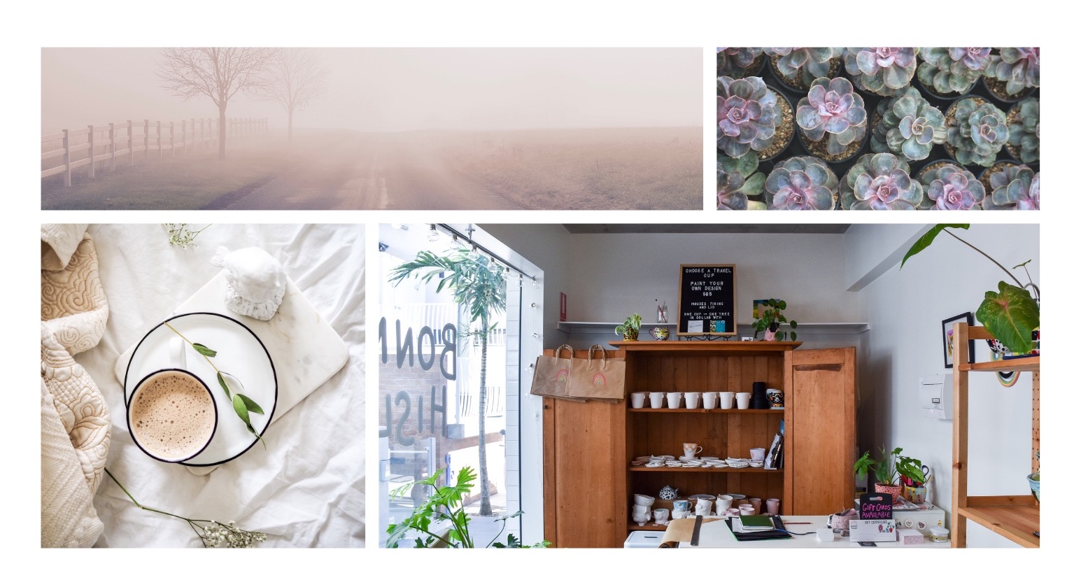
The four inspiration images share unifying colors and moods. They are all calm and muted, with enough elements to be engaging without being overwhelming.
None of these images demands action or haste — they’re all subdued, yet interesting.
Example 2: Fitness Website
Next up, let’s look at website brand guidelines for Flex Fitness, a gym in the lovely town of Fictionalville.
LOGO
The logo is written in the DM SERIF DISPLAY font, chosen for its solid presence and heavy appearance.
The logo also incorporates the bright orange of the color palette. The orange is bright enough to grab attention, yet not so bright that it’s illegible.
Bright colors can be tricky — if they’re too bright, the words can be impossible to read. Check out this yellow example:
(See what I mean?)
Happily, the orange in this logo shows up just fine.
Plus, the owner has the logo in both horizontal and vertical format. She will be able to change logo displays on the desktop vs mobile version of the website.
COLORS
The colors are drawn from the inspiration photos. The gym owner has picked a light orange, dark orange, neutral gray, and purple accent.
FONTS
The two fonts are different enough for distinction, yet both clear and legible for online and offline use.
The title text, DM SERIF DISPLAY, is a solid serif font that demonstrates seriousness. This gym is all about getting down to business — in this case, the business of fitness!
The paragraph text, POPPINS LIGHT, is easy to read and modern. It brings modernity and crispness to balance the gym’s heavy serif titles.
IMAGES
The four inspiration images share unifying colors, motifs, and moods. They all have elements of orange and activity, bringing motion and feelings of determination and grit to these brand guidelines.
Example 3: Laundromat Website
Finally, let’s look at website brand guidelines for Spin N’ Clean laundromat in Redding, California.
(Invented at random — although if there is a laundromat in Northern California that needs website brand guidelines, here ya go!)
LOGO
The logo is written in a clear, crisp font. Along with the laundromat name is an icon of a dress shirt — a visual cue of the nature of the business.
Again, the logo is prepared in both horizontal and vertical format for easy use in different scenarios.
COLORS
The colors are a mix of blues and grays, with an overall mood of cleanliness and calm.
FONTS
Both fonts are sans serif, but they are different enough that titles and paragraphs will be distinct.
The title font, ALYSSUM, is bold and easy to read at a distance. It will stand out on webpages and in print marketing.
The paragraph font, ROBOTO, is clean and crisp — good visual cues for audiences looking at a laundromat website!
IMAGES
The images are a mix of clothing and laundry images, plus a photo of the owners’ family.
All four images are united by calm blues and muted gray tones.
Feeling Inspired?
You’re in luck!
When you’re ready to create your guidelines, download my FREE website brand guidelines template from Canva. Happy designing!


